Statistics and Charts
The Statistics tab transforms raw task data into powerful visual insights and interactive analytics. Beyond providing comprehensive data visualization, these charts serve as direct navigation tools - enabling you to seamlessly filter and drill down into specific task categories with a single click. This dual-purpose design bridges the gap between analytical understanding and operational task management.
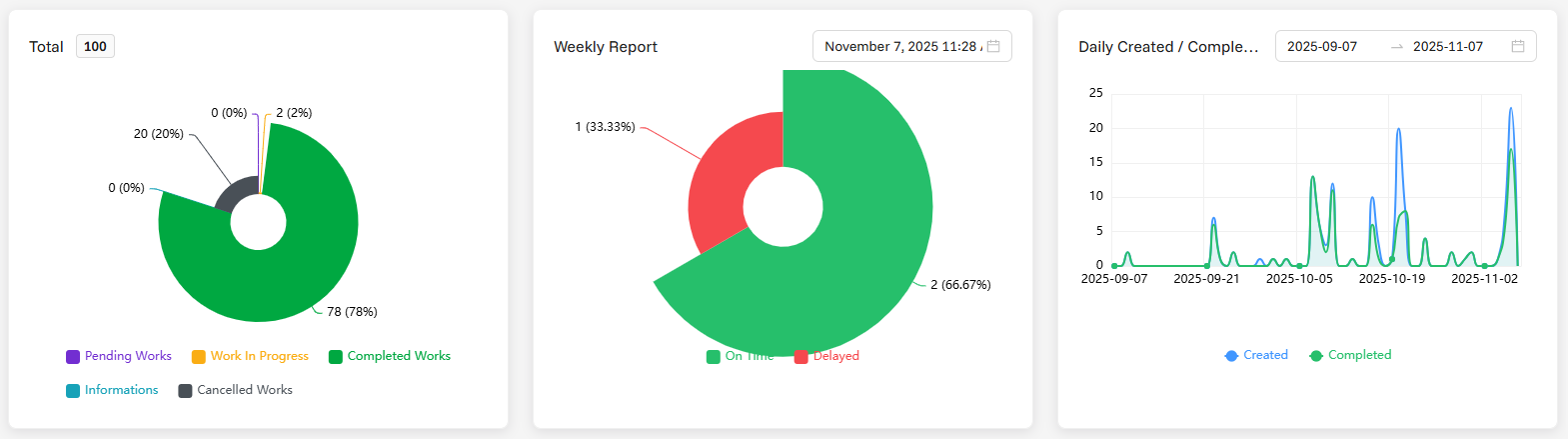
🎯 Key Feature: The status distribution chart is fully interactive - click on any pie segment to instantly filter your task list and return to operational view with that specific status filter applied.
Chart Types
1. Task Status Distribution (Interactive Pie Chart)
- Format: Nightingale Rose Chart with distinct color-coded segments
- Data: Real-time distribution of tasks across all status categories
- Interactive Filtering: Click any pie segment to instantly filter tasks by that status
- Automatic Navigation: Clicking a segment automatically switches to Tasks tab with applied filter
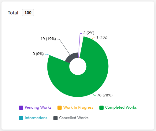
⚠️ Important: Status filtering is mandatory - you cannot view all statuses simultaneously. Clicking a pie segment applies that status filter and switches you to the Tasks tab for operational work.
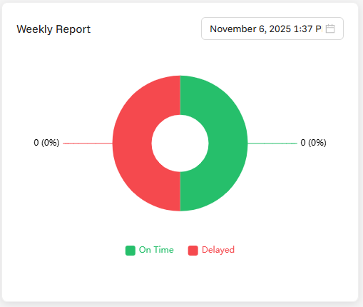
2. Weekly Summary
- Format: Comparative bar chart displaying weekly deadline performance analytics
- Data: Comprehensive distribution analysis of on-time vs delayed task completions over selected weekly periods
- Performance Tracking: Advanced timeliness metrics showing deadline adherence patterns and completion efficiency
- Deadline Analysis: Visual comparison between planned completion dates and actual completion times
- Week Filtering: Built-in weekly period selector to analyze specific weeks or compare performance across different timeframes
- Analytics Display: Performance-focused informational chart with filtering capabilities for targeted deadline analysis
- Efficiency Monitoring: Provides insights into team productivity and deadline management effectiveness
Filter Options:
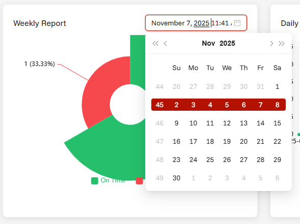
- Week Selection: Choose specific weeks for focused performance analysis
- Weekly Period Filtering: Filter data to examine particular weekly performance patterns
- Flexible Timeline: Adjust weekly scope to compare performance across different periods
Summary Information:
- On-Time Completion Metrics: Detailed count and percentage of tasks completed within their planned deadlines across the selected week period
- Delayed Task Analysis: Comprehensive breakdown of delayed task distribution, severity patterns, and delay duration within chosen timeframe
- Performance Ratio Calculation: Weekly completion efficiency ratios comparing successful on-time deliveries against delayed completions
- Deadline Adherence Trends: Historical performance trend analysis for filtered periods showing improvement or decline patterns
- Comparative Week Analysis: Week-over-week performance comparison to identify consistency and improvement opportunities
3. Daily Summary
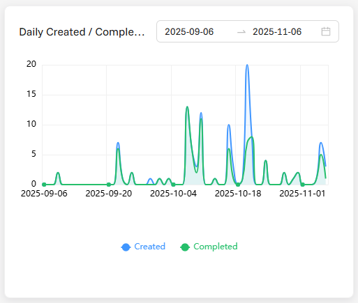
- Format: Dual-line time series chart displaying daily task creation and completion trends
- Data: Comprehensive daily task creation and completion metrics with historical patterns
- Dual Metrics: Shows both task creation volume and completion volume across multiple days
- Comparative Analysis: Enables comparison between task input (creation) and output (completion) rates
- Time Period: Tracks task creation and completion flow across selected time periods
- Filtering Capability: Built-in date range filter to focus on specific time periods
- Analytics Focus: Workload balance analysis, capacity monitoring, and completion rate tracking
- Display Only: Non-interactive chart designed for trend observation and performance insights
Filter Options:
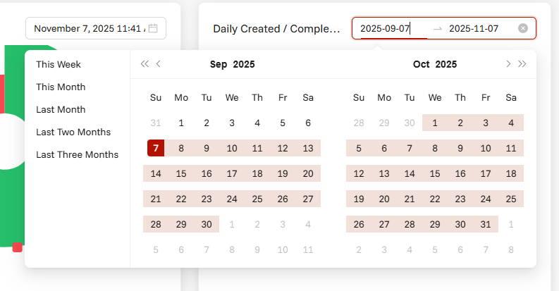
- Date Range Selection: Choose specific start and end dates for focused analysis
- Time Period Filtering: Filter data to examine particular weeks, months, or custom periods
- Flexible Analysis: Adjust time scope to identify patterns within specific date ranges
⚠️ Important Limitation: Data is limited to the last 3 months only. You can only view and filter task creation and completion data within this 90-day period for performance and data management purposes.
Detailed Analytics:
- Daily Creation Volume: Exact number of tasks created each day within selected period
- Daily Completion Volume: Exact number of tasks completed each day within selected period
- Creation vs Completion Balance: Visual comparison between task input and output rates
- Workload Flow Analysis: Understanding of task creation and completion flow patterns
- Capacity vs Performance: Visual insights comparing workload intake with completion capacity
- Trend Indicators: Recognition of creation/completion rate trends and seasonal patterns
- Bottleneck Identification: Ability to spot periods where creation exceeds completion or vice versa
Interactive Chart Features
Status Chart Interactivity (Exclusive)
- Only Interactive Chart: Status distribution pie chart is the sole interactive element
- Click Action: Single click on any pie segment applies that status filter and navigates to Tasks tab
- Visual Feedback: Selected segment remains highlighted to show active filter
- Seamless Transition: Smooth transition between analytical view and operational task management
Other Charts (Display Only)
- Weekly Summary: Pure analytical display without interactive capabilities
- Daily Summary: Informational trend chart for monitoring purposes only
- Read-Only Analytics: These charts serve exclusively for data visualization and trend analysis
Interactive Elements
- Hover Details: Detailed tooltips show exact numbers and percentages when hovering over chart elements
- Responsive Design: Charts adapt to different screen sizes while maintaining interactivity
- Accessibility: Full keyboard navigation support for chart interaction
Responsive Design
Desktop View (≥800px)
- Full Statistics Tab: Complete analytics interface with all charts visible
- Interactive Filtering: Full pie chart interaction with immediate task filtering
- Optimal Layout: Charts arranged for maximum analytical insight
Mobile View (<800px)
- Statistics Tab Hidden: Tab automatically hidden on smaller screens
- Tasks Tab Focus: Emphasis on operational task management for mobile workflows
- Responsive Navigation: Streamlined interface optimized for touch interaction
💡 Analytics Tip: Use the interactive pie chart regularly to quickly switch between different task status views - it's the fastest way to transition from analytical insights to focused task execution!